


When it comes to selling a property in London’s fiercely competitive market, every detail matters. From the gleaming kitchen worktops to the manicured front garden, buyers are making snap judgements from the moment they step through the door. But there’s one element that influences their perception more than almost anything else — the colour on the walls.
It might seem superficial, but decades of estate agent experience and mounting research confirm that wall colour can make or break a sale. The wrong shade can make a room feel cramped, dated, or cold. The right one can flood a space with light, create an emotional connection, and ultimately push buyers to make an offer faster and at a higher price.


So, which colours are working hardest in London’s property market right now? Here are the top 10 wall colours that are helping sellers seal the deal.
1. Warm White
If there’s one colour that dominates London property sales, it’s warm white. Not the clinical, blue-tinged white of a hospital corridor, but a softer, creamier version that makes rooms feel fresh yet inviting. Shades like Farrow & Ball’s Wimborne White or Dulux’s Natural Calico are perennial favourites among property stylists.
Warm white works because it serves as a blank canvas. It allows buyers to project their own vision onto a space without the distraction of bold colour choices. In London, where natural light can be limited — especially in basement flats and north-facing terraced houses — a warm white bounces whatever light is available around the room, making even modest spaces feel open and airy.
Estate agents across the capital consistently report that properties painted in warm white attract more viewings and spend fewer days on the market.
2. Soft Grey
Grey has been the darling of interior design for the better part of a decade, and its staying power in the London property market is remarkable. The key is choosing the right tone. Cool, dark greys can feel oppressive in smaller London flats, but a soft, warm grey — think Cornforth White or Purbeck Stone from Farrow & Ball — strikes the perfect balance between contemporary style and universal appeal.
Soft grey communicates sophistication without being polarising. It pairs beautifully with both modern and period features, making it equally at home in a Victorian terrace in Clapham as it is in a new-build apartment in Canary Wharf. Buyers perceive grey-painted homes as well-maintained and move-in ready, which translates directly into faster sales.
3. Greige
Can’t decide between grey and beige? You’re not alone, and that’s precisely why “greige” has become one of the most powerful selling colours in London. This hybrid shade combines the warmth of beige with the modernity of grey, creating a neutral that feels both timeless and on-trend.
Greige tones like Skimming Stone or Elephant’s Breath by Farrow & Ball have almost cult status among London homeowners preparing to sell. The colour adapts beautifully to different lighting conditions — appearing warmer in south-facing rooms and cooler in north-facing ones — which makes it incredibly versatile across the varied orientations of London housing stock.
4. Pale Sage Green
Green has surged in popularity over the past few years, reflecting a broader cultural shift towards nature, wellness, and biophilic design. In the London property market, pale sage green has emerged as a standout shade that resonates with buyers seeking a sense of calm amidst the chaos of city living.
A muted sage on the walls — such as Farrow & Ball’s Mizzle or Little Greene’s Salix — adds character without overwhelming a room. It works particularly well in kitchens, bathrooms, and garden-facing rooms, creating a gentle connection to the outdoors. Properties featuring sage green accents are increasingly attracting premium offers, particularly in leafy boroughs like Richmond, Dulwich, and Highgate.
5. Off-White with a Yellow Undertone
London’s grey skies are legendary, and savvy sellers know that counteracting them with a touch of warmth can make all the difference. Off-whites with a subtle yellow undertone — such as New White by Farrow & Ball or Jasmine White by Dulux — inject a quiet sunshine into rooms without veering into overtly yellow territory.
This colour is especially effective in period properties where original features like cornicing, ceiling roses, and sash windows benefit from a backdrop that feels heritage-appropriate yet fresh. Buyers touring properties on drizzly London afternoons are subconsciously drawn to spaces that feel warm and welcoming, and this shade delivers exactly that.
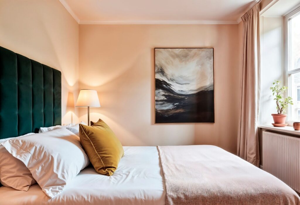
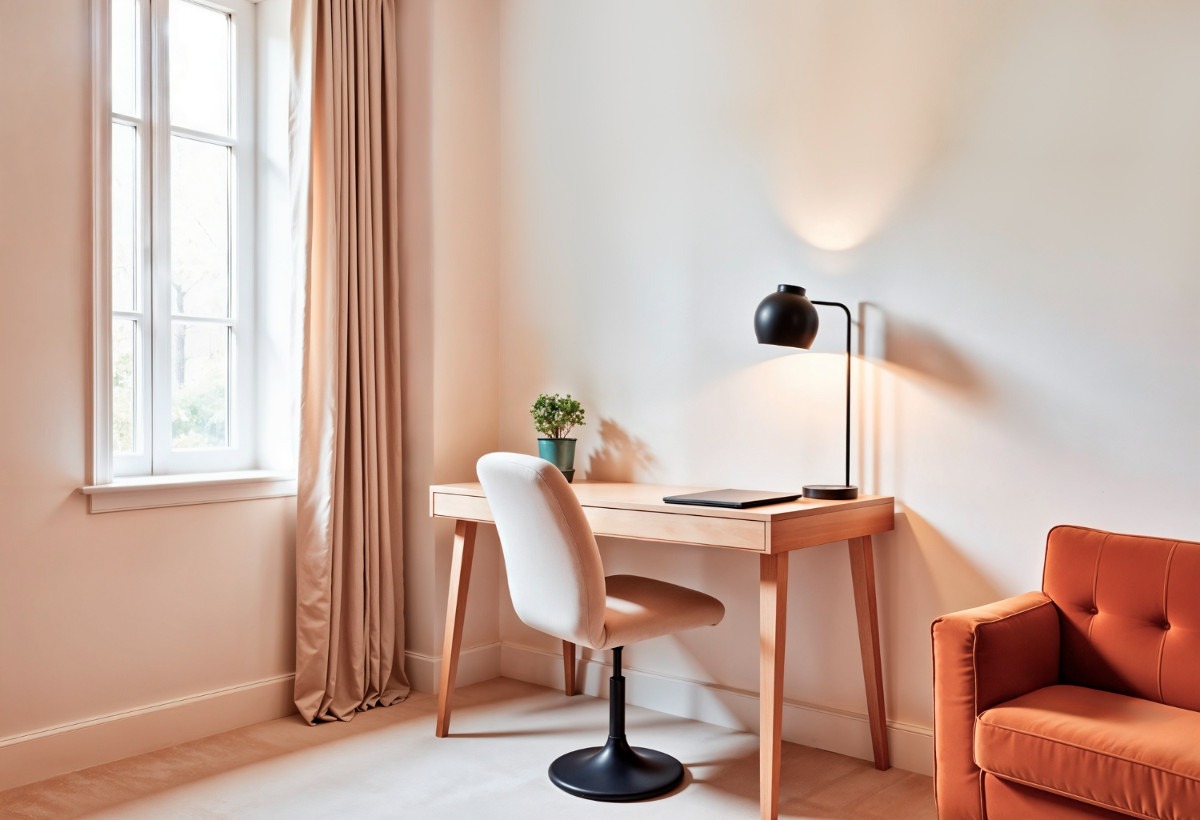
6. Soft Blush Pink
Once considered too bold for a property sale, soft blush pink has proven its worth in the London market — when used judiciously. We’re not talking about Barbie pink; rather, barely-there blush tones like Setting Plaster or Pink Ground by Farrow & Ball that read almost as a warm neutral.
Blush pink works exceptionally well in bedrooms and living rooms, where it creates an atmosphere of comfort and luxury. It has proven particularly effective in properties targeting young professionals and first-time buyers in areas like Battersea, Hackney, and Brixton. The colour adds personality without alienating buyers, giving a room a distinctive character that photographs beautifully for online listings — a crucial factor when the vast majority of property searches begin on a screen.

7. Pale Blue
There’s a reason blue consistently ranks as the world’s most popular colour. In the context of London property sales, pale blue shades evoke feelings of serenity and spaciousness that buyers find irresistible. Tones like Borrowed Light from Farrow & Ball or Blue Horizon from Dulux can make rooms feel as though they stretch further than their actual dimensions.
Pale blue is particularly effective in bathrooms and bedrooms, where its calming qualities align with the function of the space. In London’s premium market — Kensington, Chelsea, Notting Hill — pale blue walls in a well-appointed bathroom can elevate the entire property’s perceived value. It suggests cleanliness, tranquillity, and attention to detail, all qualities that affluent buyers are willing to pay a premium for.
8. Taupe
Taupe is the quiet achiever of the property colour world. Neither brown nor grey, this understated neutral has a depth and richness that creates a sense of quiet luxury. Shades like Charleston Gray or London Stone from Farrow & Ball bring warmth and gravitas to a space without the heaviness of darker colours.
In London’s mid-to-upper market, taupe walls signal a sophisticated owner with good taste. The colour works brilliantly in living rooms, hallways, and dining rooms, providing a sumptuous backdrop for both contemporary and traditional furnishings. Properties painted in taupe tones often receive feedback from viewers describing them as “homely” and “elegant” — precisely the emotional response that drives faster sales.
9. Charcoal (as an Accent)
While painting an entire London flat in charcoal would be inadvisable, using a deep charcoal as an accent wall or in specific rooms — such as a study, feature wall in the living room, or a downstairs cloakroom — can create dramatic impact that makes a property memorable.
Shades like Railings or Off-Black by Farrow & Ball, used sparingly, add depth and drama that photographs exceptionally well. In a market where buyers scroll through hundreds of listings online, a property with a striking charcoal accent wall stands out from the sea of all-white interiors. The key is balance: pair it with lighter tones elsewhere and ensure the room has adequate lighting. When done right, charcoal accents can make a property feel curated and design-forward, attracting style-conscious buyers willing to pay a premium.
10. Warm Cream
Sometimes the classics endure for a reason. Warm cream remains one of the most reliable colours for selling London properties, particularly in the family home market. Unlike stark white, cream feels lived-in and welcoming. Shades like Matchstick by Dulux or Tallow by Farrow & Ball create an enveloping warmth that makes larger properties feel like homes rather than show flats.
Cream is especially effective in suburban London — think Chiswick, Wimbledon, and Bromley — where families are looking for spaces that feel nurturing and established. It complements wooden floors, exposed brick, and period features beautifully, creating a cohesive aesthetic that buyers instinctively respond to.
Final Thoughts
Choosing the right wall colour before putting a London property on the market isn’t just about aesthetics — it’s a strategic decision that can directly affect how quickly the property sells and at what price. The common thread running through all ten of these colours is versatility. They enhance natural light, complement a variety of furnishing styles, and create emotional warmth without imposing a particular taste on the buyer.
Before reaching for the paint roller, consider the specific characteristics of your property: its orientation, natural light levels, architectural style, and target buyer demographic. A consultation with a professional property stager or colour consultant can be a worthwhile investment, often paying for itself many times over in the final sale price.
In London’s property market, where competition is relentless and first impressions are everything, the colour on your walls might just be the most cost-effective selling tool at your disposal.
Ready to Sell Your London Office? Let TM Decorating Help You Choose the Perfect Colour
If you’re preparing to sell a commercial property or office space in London, the same principles apply — and the stakes can be even higher. A tired, poorly decorated office can linger on the market for months, while a freshly painted, thoughtfully presented workspace can attract serious buyers quickly and command a significantly stronger price.
Choosing the right colour palette for a commercial space requires a slightly different approach than a residential property. Office buyers and investors are thinking about productivity, brand neutrality, and the impression the space will make on their future employees and clients. Getting that balance right demands professional expertise.
That’s where TM Decorating comes in. Based in North London, TM Decorating is a trusted experienced painter and decorator firm who specialise in preparing properties — both residential and commercial — for sale. Whether you’re refreshing a single-room office or redecorating an entire commercial floor, their skilled team will help you select the colours and finishes that will make the strongest impression on potential buyers and investors.
With deep knowledge of the London property market and a meticulous approach to every project, TM Decorating delivers results that speak for themselves — clean lines, flawless finishes, and spaces that photograph beautifully for listings.
Contact TM Decorating today for a free consultation and let their experts help you sell your office faster and for the price it truly deserves.