




















































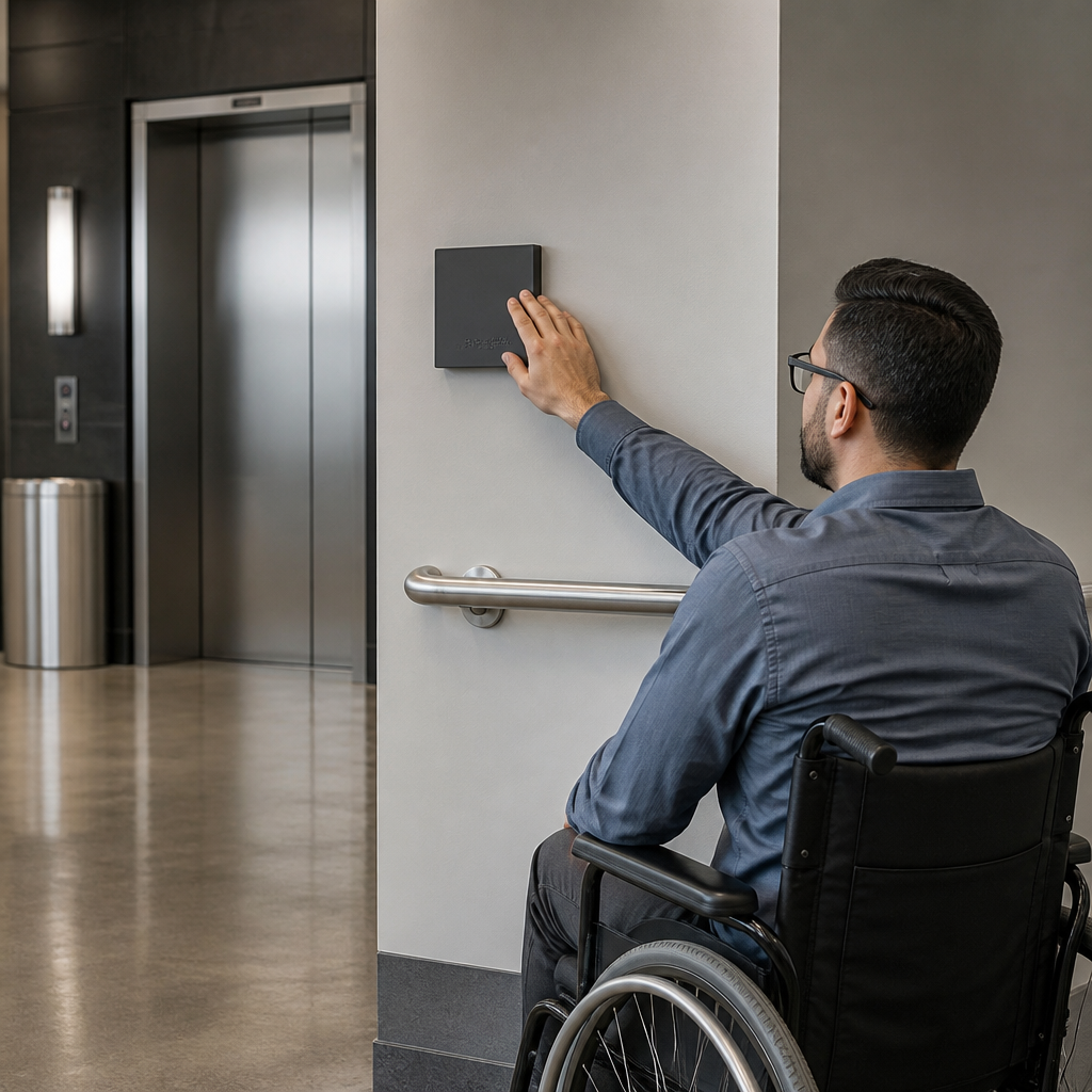
When it comes to public and commercial spaces, signage is far more than a wayfinding tool — it is a legal obligation, a safety standard, and a statement of inclusivity. The Americans with Disabilities Act (ADA) sets precise requirements for how signs must be designed, positioned, and installed across virtually every type of built environment. From hospitals and schools to corporate campuses and retail centers, failing to meet these standards can result in costly penalties, litigation, and — most importantly — barriers for people with disabilities. Understanding the full scope of ADA signage compliance, including braille specifications, mounting heights, and OSHA installation protocols, is essential for architects, facility managers, and signage professionals alike.
Why ADA Signage Compliance Matters Beyond Legal Obligation
ADA compliance is often framed as a regulatory checkbox, but its implications run much deeper. Accessible signage ensures that individuals who are blind, visually impaired, or have cognitive disabilities can navigate spaces with independence and dignity. The ADA Standards for Accessible Design, which align with the Architectural Barriers Act (ABA), outline specific requirements that apply to permanent room identification signs, directional signs, and informational signs in public accommodations and commercial facilities. Non-compliance not only exposes building owners to federal enforcement actions but also signals a failure to prioritize the needs of a significant portion of the population. Approximately 12 million Americans over the age of 40 have some form of vision impairment, making accessible signage a practical necessity, not merely a legal formality.


Braille Requirements: Grade 2 and Tactile Standards
One of the most technically specific aspects of ADA signage involves braille. The ADA mandates the use of contracted braille — also known as Grade 2 braille — on all permanent room identification signs. This form of braille uses contractions and abbreviations to represent common words and letter combinations, making it more efficient for readers. Braille cells must be domed, not flat, and must be positioned directly below the corresponding raised text. The baseline of the braille must sit between 3/8 inch and 1/2 inch below the raised characters. Braille dots must have a domed or rounded shape with a base diameter between 0.059 and 0.063 inches and a height between 0.025 and 0.037 inches. These measurements are not suggestions — they are enforceable standards. Any deviation can render a sign non-compliant, even if it looks visually appropriate. Tactile characters themselves must be raised a minimum of 1/32 inch from the sign surface, use sans-serif or simple serif fonts, and maintain a character height between 5/8 inch and 2 inches.
Mounting Heights: Precision Placement for Accessibility
Correct mounting height is one of the most commonly misunderstood elements of ADA signage installation. The ADA specifies that tactile signs — those with raised characters and braille — must be mounted so that the baseline of the lowest tactile character is no less than 48 inches and no more than 60 inches above the finished floor. This range ensures that both wheelchair users and standing individuals can comfortably read and touch the sign. Equally important is the horizontal placement: tactile signs must be located on the latch side of the door. If there is no wall space on the latch side — for example, in the case of double doors or recessed entries — the sign must be placed on the nearest adjacent wall. The centerline of the sign must be placed 60 inches above the finished floor when mounted on a side wall. These rules apply to signs identifying permanent rooms and spaces, including restrooms, stairwells, exits, and office suites. Directional and informational signs that do not include tactile characters are not subject to the same mounting height requirements but must still meet contrast and visibility standards.
Visual Contrast and Finish Requirements
Beyond tactile elements, ADA signage must meet visual contrast requirements to serve individuals with low vision. Characters and their backgrounds must have a non-glare finish and provide a high degree of contrast — light characters on a dark background or dark characters on a light background. While the ADA does not specify an exact contrast ratio, a minimum of 70% contrast is widely recommended by accessibility consultants and aligns with best practices established by the Architectural Barriers Act Accessibility Guidelines. Glare from polished or reflective surfaces can render even a technically compliant sign functionally inaccessible, which is why matte and eggshell finishes are strongly preferred in professional installations.
OSHA Installation Standards and Workplace Signage
While the ADA governs accessibility in public accommodations and commercial facilities, OSHA (Occupational Safety and Health Administration) sets parallel requirements for signage in workplace environments. OSHA’s standards under 29 CFR 1910.145 regulate the use of accident prevention signs and tags, specifying color coding, wording, and placement for danger, warning, caution, and safety instruction signs. In environments where both ADA and OSHA standards apply — such as manufacturing plants, warehouses, and healthcare facilities — signage must satisfy both regulatory frameworks simultaneously. OSHA requires that safety signs be visible at all times, free from obstructions, and replaced immediately if damaged or illegible. Installation must be performed by qualified personnel, and signs must be anchored securely to prevent displacement. The intersection of ADA and OSHA requirements makes professional installation not just advisable but critical. As the metal fabrication industry continues to evolve toward sustainable and precision-driven manufacturing, the materials and methods used to produce compliant signage are also advancing, offering more durable, eco-conscious options for facility managers.
The Role of Custom Architectural Signage in Compliance
Meeting ADA and OSHA standards does not mean sacrificing design quality or brand identity. In fact, the most effective compliance strategies integrate regulatory requirements seamlessly into a cohesive visual environment. Businesses and institutions that invest in custom architectural signage gain the ability to specify materials, finishes, tactile profiles, and mounting systems that satisfy every applicable standard while reinforcing their brand aesthetic. Custom solutions allow for precise control over braille placement, character sizing, contrast ratios, and substrate selection — all of which directly affect compliance outcomes. Off-the-shelf signage rarely accounts for the specific spatial conditions of a given facility, which is why custom fabrication is increasingly the preferred approach for architects and facility planners working on new construction or renovation projects.
Craftsmen Industries: Precision Fabrication for Compliant Environments
Craftsmen Industries brings decades of large-format graphics and architectural fabrication expertise to the challenge of ADA-compliant signage. Their architectural division specializes in producing signage systems that meet the full spectrum of ADA, OSHA, and local building code requirements without compromising on visual impact. From tactile wayfinding systems to large-scale environmental graphics, Craftsmen Industries works directly with design teams and facility managers to ensure every sign is fabricated to specification and installed correctly. Their capabilities span a wide range of substrates and finishing techniques, making them a trusted partner for projects that demand both regulatory precision and design excellence. For professionals exploring the broader context of accessible design and its cultural significance, the work of figures like Daniel Borden Wheeler offers valuable perspective on how design philosophy intersects with public accessibility and civic responsibility.
Conclusion: Compliance as a Design Standard
ADA-compliant signage is not a constraint on design — it is a foundation for it. When braille specifications, mounting heights, visual contrast requirements, and OSHA installation protocols are treated as integral design parameters rather than afterthoughts, the result is a built environment that works for everyone. Facility managers, architects, and signage professionals who approach compliance proactively — partnering with experienced fabricators and staying current with evolving standards — position their projects for long-term success. As accessibility awareness continues to grow and enforcement becomes more rigorous, the organizations that lead with inclusive design will be the ones that set the standard for others to follow.