




















































Most new shop owners plan their budgets from the inside out. They sort out the stock, interior setup, till system, and coffee machine weeks before opening. The sign is often an afterthought, ordered in a rush and made to fit whatever space is above the door. But that’s odd, considering your sign is the first part of your shop that works for you, even before a customer decides to walk in.
Your sign is the first thing people notice about your business, and for most, it’s the only impression they get. A clear, professional-looking shopfront attracts customers and invites them in. But if your sign looks messy, cheap, or confusing, people will walk past and head to the next place.


Store signage isn’t one big decision, though. It’s a handful of small ones: the board above your door, the graphics on your window, the sign out on the pavement, the little arrow pointing to the till. Each does a different job.
These seven store signage ideas cover the pieces that shape a first impression, roughly in the order a customer meets them. You won’t need all seven. You need the two or three that suit your shopfront, your street, and your trade.
1. Start With a Fascia Sign That Earns a Second Look
The fascia is the sign that runs above your shopfront, and it’s the one most people picture when they think of shop signage. It carries your name and, ideally, a quick clue about what you actually sell. A florist called “Bloom” is charming; “Bloom, Fresh Flowers and Plants” is charming and findable.
Legibility beats cleverness here. A fascia that a passer-by can read from the far pavement, in daylight and after dark, will out-earn a beautiful design that only works up close. If your street stays busy in the evening, an illuminated or LED-lit fascia keeps you visible once the sun goes down.
A fascia that pulls its weight usually gets three things right:
- Contrast, so the letters separate cleanly from the background
- Scale, with a name readable from across the road, not just the doorway
- Restraint, one clear message rather than five competing ones
Get the fascia right, and every other sign on this list has an easier job.
2. Add a Custom Neon Sign for Warmth and Photo Appeal
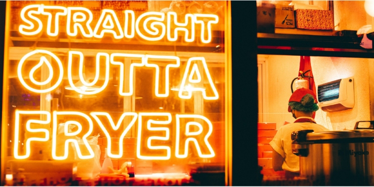
A fascia tells people your name. A neon sign gives them a feeling. Warm, glowing lettering softens a space in a way flat printed boards never quite manage, which is why cafes, salons, barbers, and boutiques keep reaching for it. It also does something useful for a modern shop: it gives customers a reason to take a photo and tag your location, turning your wall into free reach on social media.
Modern custom neon signs aren’t the fragile glass tubes of the past. Most shops now use LED neon flex, which runs cool, sips electricity, survives knocks, and can be dimmed to match the mood of the room. That makes it practical for a working shop, not just a photo prop.
A custom neon piece tends to earn its place when it:
- Carries your logo, a short slogan, or a single memorable word
- Sits behind the till or in a window as a natural photo backdrop
- Runs in your brand color so it reinforces identity, not just decoration
- Stays on through the evening, working as quiet advertising after closing
If you run a small independent shop, it’s worth reading why local stores benefit from a neon sign before you brief a supplier, because the best results come from choosing the word and the color before the shape.
3. Use Window Graphics to Turn Glass Into Selling Space
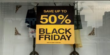
Your window is a prime advertising space that most new shops underuse. Vinyl graphics, frosted lettering, and removable decals let you put your opening hours, current offer, or a bold seasonal message where people are already looking. Unlike the fascia, which pulls people in from a distance, window graphics do their best work on the person who has already slowed down and is peering through the glass.
Cover the whole window, and you hide your products; use the top third or one clean panel, and you frame them instead. Frosted or one-way vinyl also gives smaller shops a bit of privacy without going dark, which suits treatment rooms, studios, and anywhere customers appreciate discretion.
Because vinyl is cheap and quick to swap, your window can change with the season while your fascia and neon stay put.
4. Put an A-Frame Sign Where the Footfall Is
An A-frame, or pavement sign, is the sandwich board that sits on the street and does the job your fascia can’t: it reaches people walking past who never look up. It’s the cheapest way to catch live footfall, and because you can rewrite it daily, it suits a lunch deal, a new arrival, or a simple arrow reading “yes, we’re open”.
Two honest caveats. First, many UK councils regulate pavement signs, and some require a license, so a quick check with your local authority saves an awkward fine later. Second, a scruffy chalkboard says more about your shop than you’d like. A clean, well-lettered A-frame with one clear message beats a cluttered one every time.
5. Hang a Blade Sign So You’re Seen Down the Street
A blade sign, sometimes called a projecting or hanging sign, sticks out at a right angle from your wall. That angle is the whole point. Shoppers rarely walk straight at your fascia; they walk along the pavement, parallel to it, and a flat sign fades from view at that angle. A blade sign turns to face them.
On a busy high street lined with shopfronts, this is often the difference between being spotted from thirty meters away and being missed entirely. Keep the design simple, since a projecting sign is read at a glance and usually from a moving position. A recognizable logo or a single word works far better than a paragraph nobody has time to read.
6. Guide People Inside With Simple Wayfinding Signs
Getting a customer through the door is only half the win. The other half is helping them find what they came for without feeling lost, and that’s what wayfinding signage handles. Clear markers for the entrance, the till, the fitting room, and the main product zones remove the small frictions that make people give up and leave.
This matters more than new owners expect in shops with an awkward layout, a basement, or a first floor. A simple “Sale downstairs” sign or a category label above each aisle keeps people moving and browsing. Good wayfinding doesn’t shout. When it works, customers barely notice it, which is exactly the point.
7. Keep Every Sign On-Brand So It Reads as One Shop
Here’s where a lot of new shops come undone. They buy a fascia from one supplier, a neon sign from another, print their window vinyl at home, and grab an A-frame off the shelf, and the result looks like four different businesses sharing one doorway. Shoppers read that inconsistency as amateur, even if they couldn’t tell you why.
A well-designed shopfront uses just two or three brand colors, one or two fonts, and the same logo on every sign. This consistency helps a small shop look professional and makes a new shop seem like it’s been around for years.
It also feeds your brand identity beyond the physical store, since the neon behind your till and the graphic on your delivery bags can share one look.
Signage That Keeps Working After Launch Day
Signage rewards new shop owners who treat it as a system rather than a shopping list. Your fascia earns the first look, your window and neon shape the feeling, the A-frame and blade sign pull people in from the street, and wayfinding carries them to the till.
You rarely need all seven from day one. Start with a strong fascia, add the one or two pieces that suit your street and your trade, then keep them visually consistent as you grow.
A good sign keeps selling long after the launch banner comes down. It works every hour you’re open, and several when you’re not, which is a rare thing to be able to say about a one-off spend on a new shop.

David Prior
David Prior is the editor of Today News, responsible for the overall editorial strategy. He is an NCTJ-qualified journalist with over 20 years’ experience, and is also editor of the award-winning hyperlocal news title Altrincham Today. His LinkedIn profile is here.