

















































Arrow showing kitty witch artwork moving from a drawing tablet to a matching art print, sticker, and acrylic keychain.
Your character’s eyes sparkle, the colors glow, and every tiny accessory looks perfect on screen. Then you shrink the illustration to keychain size. Where did that necklace go?


Turning digital art into physical merch involves more than choosing “export.” Size, material, printing, and construction all affect what survives the journey.
Here is what to check before your artwork becomes something a fan can hold.
Start With the Product
Choose the product and its specifications before preparing the final file. A rectangular print, shaped sticker, and acrylic standee give the same illustration different boundaries.
If you plan to sell through artiststore: your merch store online, its print-on-demand model lets you offer products without holding inventory for those orders. Production and shipping are handled for you, but your artwork still needs to suit the selected item.
Open the current product instructions and template, where provided. Check the printable area, accepted formats, resolution, and any requirements for separate layers. Keep an editable master, then create a production copy for each format.
This avoids squeezing a finished poster into a charm template and hoping nobody notices the missing sword!
Make Small Details Read Clearly
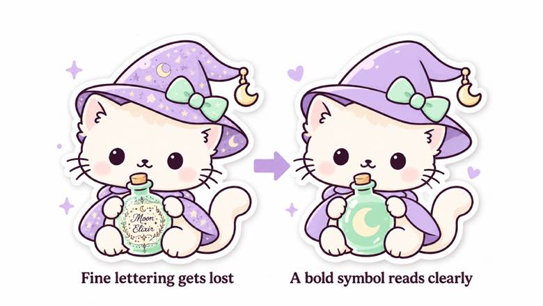
Kitty witch designs showing fine potion-label lettering replaced with a bold crescent moon for clearer small-scale printing.
A design can contain enough pixels and still be too complicated at its finished size.
Imagine a tiny witch holding a potion bottle. On a print, the bottle’s label might be readable. On a small sticker, a bold moon symbol may communicate the idea better than miniature lettering.
| Detail in the illustration | Possible production adjustment |
| Fine lettering on a prop | Enlarge it or replace it with a symbol |
| Delicate facial features | Simplify lines while preserving expression |
| Busy scenery behind a character | Reduce background detail for small formats |
| A long, narrow accessory | Reposition it to create a more compact silhouette |
Keep the features that make the character recognizable. Simplification should help someone see your design, not strip away its personality.
- Pro tip: Print a paper version at the intended dimensions, with automatic page scaling turned off. It will not predict the material or finish, but it can reveal details that become too small.
Check Pixels at the Final Size
For raster artwork, pixel dimensions matter alongside the physical print size.
At 300 pixels per inch, a three-inch-wide image needs 900 pixels across. That calculation covers the image width; any required bleed adds to the file dimensions.
Do not assume changing a resolution label from 72 to 300 creates new detail. Without resampling, the pixel count stays the same. Enlarging through resampling adds pixels, but it cannot guarantee faithful recovery of details missing from the original.
Work from your original artwork rather than a screenshot or compressed social media download. Use the resolution requested for that product instead of treating one number as a universal rule.
Plan for Edges and Hardware
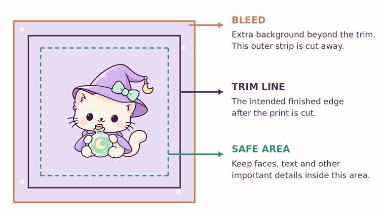
Kitty artwork showing bleed beyond the trim line, the finished cut edge, and an inner safe area for important details.
The edge of your canvas is not always the edge of the finished product.
Where trimming is involved, bleed extends the background beyond the intended cut. A safe area keeps important artwork inside that boundary. Use the template’s measurements; a margin suitable for one item may not suit another.
Physical construction also needs room. A keychain has an attachment point, while a standee may need a tab that fits into its base. Keep important details clear of those areas and confirm how they affect the layout.
Do not invent a cut line if the manufacturer prepares it. Provide clear artwork and review the proposed outline during proof review.
Treat Color and Transparency Separately
A screen emits light; printed merchandise reflects it. The material, ink, finish, and viewing conditions all influence the result, so a luminous screen preview cannot promise identical printed color.
Follow the requested color mode and profile. Some workflows accept RGB files, while others request CMYK. Avoid converting automatically just because the artwork is “for print.”
Transparency needs its own check. A white background and a transparent background are different file properties. For clear acrylic, ask how white ink supports the printed colors and which areas should remain see-through.
Keep notes specific. “This bottle should be translucent; the character should be opaque” gives the production team more useful direction than “make it magical.”
Review the Actual Production File
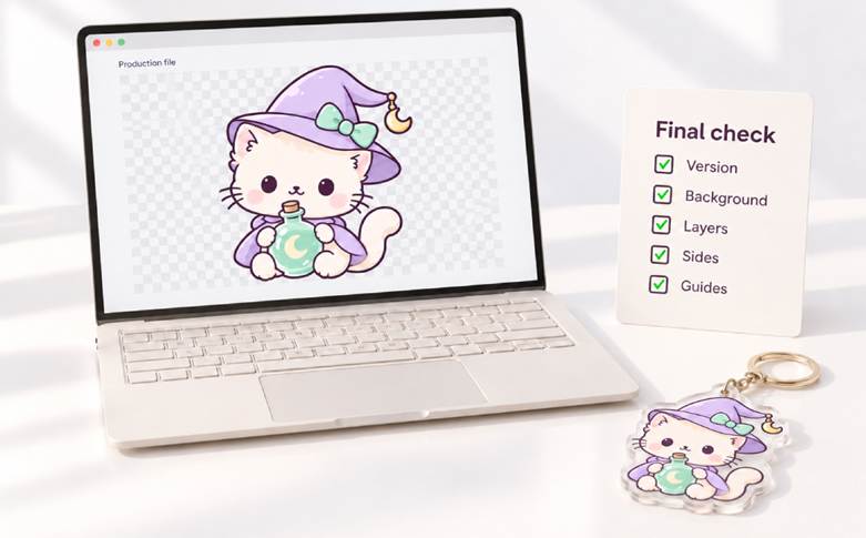
Kitty witch artwork on a laptop beside a production checklist with five green check marks and a matching acrylic keychain sample.
Before submitting, open the exported file and check:
- Version: Is this the approved artwork for the correct product and size?
- Background: Have unwanted backgrounds and stray pixels been removed?
- Layers: Are required layers named and preserved?
- Sides: Are front and back files clearly identified, with readable text?
- Guides: Are template markings hidden or retained according to instructions?
If a proof is provided, review its layout carefully. A digital proof can help catch positioning errors, but a physical sample is more useful for assessing material, finish, and color.
Final Thoughts
Preparing artwork for production protects the details that made you love it in the first place. Choose the product, adapt the design, and check the exported file before approving the next step.
Your fans will never see your layers panel. Give them a finished piece that makes the artwork feel just as considered!