



















































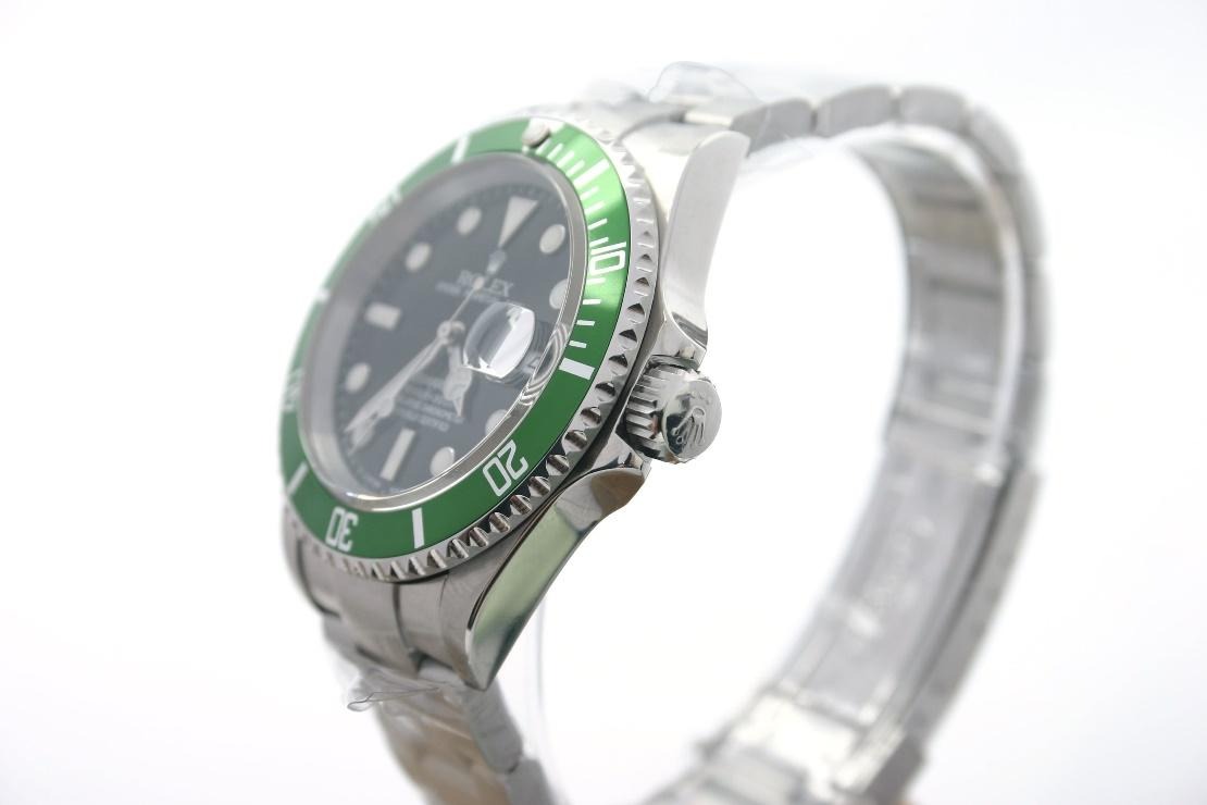
Buying a watch online is basically a photo test. Listings often come with a pile of angles—wrist shots, straight-on dial pictures, close-ups of the hands and indices, and sometimes a short video under bright studio lighting. On paper, that sounds like enough to decide.
In reality, it’s not.


Photos do a good job with the visible stuff: color, dial layout, obvious wear, and the general look of the case and bracelet. The problem starts the moment you wear the watch. You’re judging movement through your day—how it sits, how it flexes, how the finishing behaves in ordinary light, and whether it feels crisp or vague when you operate the controls.
That gap is where people get burned.
For buyers trying to work out which details actually matter beyond a polished product listing, Economic Times has also looked at the smaller things first-time watch buyers often miss, including finishing, movement choices and the kind of inspection that is difficult to judge from photos alone.
Case thickness is only the start of the “fit” story
Most sellers lead with diameter. Then they add thickness: “41mm,” “43mm,” whatever the spec sheet says. It’s a useful reference, but it doesn’t tell you how the watch will wear.
Two watches can share the same diameter and still feel totally different. Thickness is only one piece of the puzzle. Lug shape, case curvature, and the way the case angles to your wrist change the whole impression. Curved lugs can tuck in and reduce the perceived bulk. Flatter geometry can do the opposite, making the same measurements look thicker once it’s on you.
Side-profile images help, sure. But you still can’t fully judge visual bulk until you’ve got it on your wrist and you can see it move with you.
This shows up fast with sports watches and chronographs. Even small thickness differences can shift the overall feel more than dial design or bezel styling does.
Bracelets look great lying flat, then surprise you when worn
A bracelet can look stunning when it’s photographed on a table. That’s because it’s not being asked to do anything yet.
Once it’s on your wrist, the way links articulate matters more than the pretty geometry in a listing. A bracelet that looks tight and rigid in pictures might feel stiff and unforgiving in real life. Another might have enough play to wrap naturally and become less noticeable as you wear it.
There’s also the question of looseness. Some movement is normal, especially on older pieces. Too much, though, shifts the impression of quality quickly.
Still images don’t measure any of that. Video is better—if the seller actually moves the bracelet and shows how it behaves around the wrist, not just rotating the watch under lights.
Handling it yourself remains the only reliable test.
The clasp is where “looks good” often stops matching “works well”
Clasp photos usually focus on condition. Scratches, polishing marks, dents—those are visible, and they matter.
What’s harder to capture is how the clasp behaves in your hand. Does it close cleanly? Is the snap confident or kind of mushy? Does it wobble after it locks? How smooth is the micro-adjustment when you’re trying to dial in fit?
You touch the clasp constantly. Daily, sometimes more than once.
A clasp that photographs beautifully can turn out merely okay once you live with it. The reverse happens too. That’s one reason two watches with similar specs can feel nothing alike when you own them.
Finishing and color shift fast under different lighting
Studio lighting makes metal look dramatic. That’s not automatically dishonest. It’s just how surfaces react to strong, controlled light.
Bright setups pull polished edges into sharper relief, deepen the look of brushing, and boost dial contrast beyond what you usually see in everyday conditions. Out in normal light, a bezel that reads nearly black in one photo can turn mirror-like. A sunburst dial that looks muted indoors can flare brighter under direct sun. Even brushed steel changes character depending on the angle you’re viewing it from.
Comparisons online get messy because two sellers can photograph the same model reference under totally different lighting and editing. The watch stays the same. The presentation doesn’t.
Dial color is easy to misread, even with good photos
Blue is the obvious trap. It can look navy in one image, electric blue in another, or almost black when the lighting drops.
Green, champagne, and silver dials can mislead just as easily. Camera settings, screen brightness, color correction, and the actual light hitting the watch all affect what you think you’re seeing.
So trusting one retailer’s images can lead you astray, even when their photography is technically excellent.
Wrist shots from different owners usually give a better sense of how a dial behaves across lighting conditions. It’s still not perfect. It’s just closer to reality.
Controls—the crown and pushers—don’t translate well in stills
People naturally fixate on the dial and case. The crown often only gets attention when something looks off.
That’s a shame because the crown is one of the few parts you operate every time you interact with a mechanical watch. How it unscrews, how it winds, and how it sets the time all feed into the sense of refinement.
Chronograph pushers have the same issue. Some feel crisp and deliberate. Others demand more pressure and a different kind of effort. Photos don’t capture that sensation, and they definitely don’t show how consistent the feel is over time.
If you’re buying remotely, detailed video matters because it shows the controls being used. A seller who describes the action clearly also helps. A spec sheet can tell you what movement sits inside. It can’t tell you whether the controls feel satisfying.
Weight and balance can surprise you more than you expect
Weight is another number that doesn’t map neatly to experience. Heavier doesn’t automatically mean better. Lighter doesn’t automatically mean cheap.
What changes the feel is where the weight sits and how it’s distributed. A large watch head on a relatively light bracelet can feel top-heavy. A watch with better balance across the wrist can feel more comfortable even if it weighs more overall.
Materials add another layer. Titanium can make a substantial case feel surprisingly light. Precious metals can make a case feel heavier than dimensions alone suggest.
People sometimes mistake those sensations for “quality,” when they’re really balance, geometry, and material behavior.
You only get the real answer in your hand.
Sound almost never makes it into online listings
Mechanical watches make noise. Some of it is subtle. Some of it isn’t.
Rotors can be nearly silent or clearly audible. Bracelets can sound tight and controlled, or they can rattle more than you’d expect. Even the clasp has a sound when it closes. Enthusiasts notice these details, because they affect how substantial the watch feels.
Most listings skip all of it. Video with the original audio is useful, but a polished clip can also remove the exact sounds you’d want to hear.
It’s a small piece, but it contributes to that overall sense of refinement.
“Wrist presence” can’t be reduced to measurements
This part is hard to explain online. You can memorize diameter, thickness, lug-to-lug, and weight and still get a shock once you wear the watch.
Proportions do a lot of the work. A wide bezel can make the dial look smaller. Short lugs can make a larger case feel surprisingly wearable. An integrated bracelet changes how the watch sits as a whole. Even dial color can affect how big the watch seems on your wrist.
That’s why two watches that both read “42mm” can land very differently for the same person.
Measurements narrow the choices. They don’t finish the decision.
How to buy smarter online: ask for what photos can’t show
This doesn’t mean online watch shopping is a bad idea. It just means you shouldn’t treat pictures like the whole story.
Start with the obvious: a listing should show the watch clearly. Then push for the details that are harder to judge visually. Request side-profile shots so you can see case attitude. Ask for bracelet videos that show movement around a wrist, not just a static pose. Look for clasp photos that show condition and function. If possible, ask for wrist shots from more than one source.
When comparing super clone watches, buyers can also use SuperCloneReps.com to look through different models, factory options and watch details before narrowing down what they want to inspect more closely. Comparing several references instead of relying on one polished listing makes small differences in dial, bracelet, case shape and finishing easier to notice.
If possible, ask for wrist shots from more than one source. If the watch is expensive, try the same model reference in person somewhere else. It answers questions that dozens of online images can’t.
If the watch is expensive, try the same model reference in person somewhere else. It answers questions that dozens of online images can’t.
The internet lets you compare more watches and more prices than buyers used to. What it still can’t solve is the physical side of ownership. A watch is an object you handle every day. You feel the crown, move the bracelet, close the clasp, and notice how the case sits while you’re actually living your life.
Photos show you what the watch looks like. They still don’t fully show what it’s like to wear.