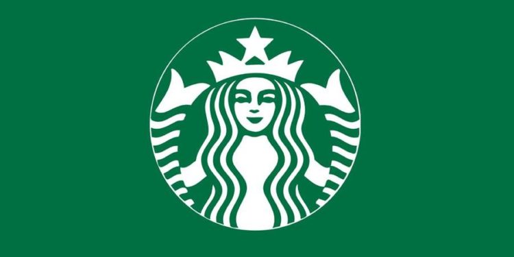
The Starbucks logo is one of the most recognized symbols in the world, but its journey from a simple coffeehouse emblem to a global cultural icon is full of unexpected twists. The siren, with her enigmatic smile and twin tails, is not just a design choice; it’s a visual representation of brand storytelling, evolution, and emotional connection with consumers. This guide uncovers the meaning and history behind the logo, the symbolism of the siren, and how businesses can draw inspiration from its success.
The Origins of the Starbucks Logo
When Starbucks opened its first store in Seattle in 1971, the founders wanted a logo that reflected their passion for coffee, seafaring traditions, and their connection to the Pacific Northwest. Inspired by a 16th-century Norse woodcut of a twin-tailed siren, they created a brown circular emblem with the words “Starbucks Coffee, Tea, Spices.”
The siren symbol was not chosen at random. She represented allure and mystery, much like the exotic appeal of freshly roasted coffee. The design communicated the brand’s identity as something both artisanal and adventurous.
Logo Evolution: A Visual Timeline

Over the decades, Starbucks streamlined its logo multiple times to stay relevant while maintaining its essence.
- 1987–1992: The logo switched from brown to the now-iconic green, symbolizing growth, freshness, and ethical sourcing. The siren’s image was slightly refined to appeal to a wider audience while still preserving the twin tails.
- 1992–2011: The focus shifted to the siren’s face. The company removed the words “Tea” and “Spices,” leaving “Starbucks Coffee” as the sole brand identifier.
- 2011 – Present: Starbucks removed all text from the emblem, leaving only the siren. This bold move reflected the company’s confidence in its global recognition and the power of minimalist branding.
The Meaning Behind the Siren
The Starbucks siren is more than a decorative figure. She embodies the core values of the brand: allure, transformation, and global connection. Her twin tails, derived from mythological depictions, symbolize balance and harmony. The design evolution also demonstrates how simplicity can amplify memorability.
The green palette reinforces these ideas. Psychologically, green evokes freshness, nature, and calmness, which align with Starbucks’ commitment to quality and sustainability. The brand’s signature color, known as “Starbucks Green,” is now instantly recognizable across the globe.
Lessons for Businesses: What Makes This Logo Iconic?
The Starbucks logo is a masterclass in brand evolution. Here are key takeaways that businesses can apply:
– Simplicity improves recognition. Every redesign made the logo cleaner and bolder.
– Symbols create emotional connection. The siren is not just an image; it’s a story consumers associate with.
– Consistency builds trust. While refined, the logo has retained its core elements over 50 years.
– Colors matter. The green hue is now synonymous with Starbucks’ values and products.
Expert Tip
Expert Insight: Many businesses hesitate to update their logos, fearing a loss of brand identity. Yet, Starbucks shows that strategic redesigns can strengthen a brand’s image if done with respect for its core elements.
PNG Versions and Modern Applications
For digital branding, PNG versions of logos are essential. Unlike JPEG, a PNG logo retains transparency, making it versatile for websites, packaging, and merchandise. Starbucks offers official PNG and vector versions of its logo for authorized use, ensuring consistent quality across digital platforms.
If you are building your own brand identity, using a transparent PNG logo will give you flexibility in marketing materials, from social media graphics to print designs.
How to Create a Logo in Starbucks’ Style with AI
Businesses often draw inspiration from Starbucks when creating their own visual identity. Platforms like Turbologo’s logo generator AI allow entrepreneurs to explore similar aesthetics while staying unique. AI tools analyze brand values, colors, and style preferences to produce professional, ready-to-use logos in just a few clicks.
By using such tools, startups can achieve a cohesive brand look without hiring expensive designers. It’s an efficient way to experiment with different layouts and color palettes, inspired by the elegance of iconic brands.
Q&A: Frequently Asked Questions
Q1: Why does Starbucks use a siren in its logo?
The siren represents allure, transformation, and a maritime heritage linked to Seattle’s coffee-trading history.
Q2: Why did Starbucks remove its name from the logo?
By 2011, Starbucks had become globally recognized, so the company simplified its emblem to rely on visual identity alone.
Q3: What is Starbucks Green?
It’s the signature shade (#00704A) that conveys freshness, sustainability, and the brand’s eco-conscious values.
Q4: Can small businesses achieve similar branding success?
Yes. By focusing on clarity, storytelling, and consistent visual elements, smaller brands can also build strong recognition.
Conclusion
The Starbucks logo stands as a blueprint for effective branding. From its siren’s mythological roots to the sleek, modern design we know today, it reflects both heritage and innovation. For entrepreneurs, the lesson is clear: powerful branding is built on consistency, meaningful symbols, and adaptability.
Want to create a professional logo inspired by iconic brands? Start exploring with an AI logo generator and shape a visual identity that resonates with your audience.


