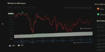
Techno and sci-fi elements are set to be a popular trend in website design for 2024, as brands try to appear more futuristic and high-tech. This is especially the case in sectors such as VR, biometric authentication and cryptocurrency. Futuristic designs and typography are set to take hold going into next year too, with impressive animations taking centre-stage for companies who want to stand out from the crowd.
The Y2K Aesthetic is Here to Stay
Minimalism might have reigned supreme for well over a decade now, but with that said, digital maximalism is back. Bold colour schemes are often present in games like online slots, with games like Big Bass Bonanza and Fruit Stack Cash Machine being prime examples of this. With that being said, bold colour schemes are extending far beyond the entertainment industry.
Abstract patterns are being used to put a fresh spin on a number of popular trends from the era. Of course, with the Y2K aesthetic being so playful and energetic, it lends itself well to motion effects and parallax scrolling too. Parallax scrolling has been adopted by numerous brands already, including Apple and IBM Design. While it’s really nothing new, it’s a way to keep clients and consumers engaged.
It comes with a caveat however, as too much of it can make users feel nauseous and it can also take way longer to load or scroll when using a mobile device. With most people browsing on a mobile over a desktop or laptop, this is a major factor to take into account if you intend to use it on your own site.
Kinetic Typography is Going to Be Huge for 2024/2025
Kinetic typography is set to be a huge trend this year. Animated text engages and excites audiences, and it’s a key factor in creating a positive user journey. It’sexpected that website designers will integrate it with other elements in an attempt to create a more immersive experience overall.
Another typography trend taking the website design industry by storm would be teleprompter typography. It’s starting to gain traction, and it could well be the case going into next year, too. Chunks of text are revealed one line at a time, going from light to black as the user scrolls through the page.
This is much more suited to brands who prefer their site to focus on visuals as it puts more of a focus on imagery rather than text.
With that in mind, it is a great way to embrace maximalism without overwhelming the page. It allows a designer to drip-feed content while being selective about the elements that are shown on the page. Teleprompter typography, when combined with the Y2K aesthetic, is the best way for you to make your site look cutting-edge going forward, even if you want a sleek and professional image.
Maximalism doesn’t have to mean using playful colours, and professional monochromatic colour schemes can be used in a way that embraces maximalism, especially when combined with kinetic typography and teleprompter reveals.
David Prior
David Prior is the editor of Today News, responsible for the overall editorial strategy. He is an NCTJ-qualified journalist with over 20 years’ experience, and is also editor of the award-winning hyperlocal news title Altrincham Today. His LinkedIn profile is here.


