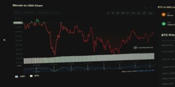
Let’s be honest—if you’re just staring at gold’s live price jumping around on your screen, it can feel like pure chaos. One minute it’s $3,275, the next it’s surged to $3,290. You might ask yourself: How do traders actually make sense of this?
The answer? They use charts.
But not just any charts. Real-time gold charts that reveal patterns, key price levels, and opportunities hidden in the noise. If you’re new to trading, learning to read these charts can be the difference between random guesses and thoughtful, strategic moves.
Why Even Bother with Charts?
Gold doesn’t move in a vacuum. Every day, traders react to news, data releases, central bank moves, or even geopolitical tensions that rattle markets. Last week alone, rumors of new US tariffs on China sent gold bouncing between $3,255 and $3,290.
If you’re just watching those numbers tick up and down, you’ll miss the bigger story. A real-time chart tells you where buyers step in, where sellers hit the brakes, and whether the overall trend is worth riding.
Think of it like reading the mood of the market. Is it confident? Nervous? Ready to break out? The chart shows you.
Making Sense of What You See
When you open your trading platform, you’ll find a few types of charts.
Line charts? They’re the simplest, plotting closing prices over time. Good for spotting a general direction but not much else.
Most traders rely on candlestick charts, which pack a lot of info into each bar: the open, high, low, and close. Those wicks and bodies tell a story. Did price shoot up but close lower? That’s sellers muscling in. Did it dip but recover fast? Buyers are fighting back.
For instance, say gold dips to $3,260 but ends the hour back at $3,275. On a candlestick, you’ll see a long lower wick—a clue that buyers defended that level. That’s the kind of subtle detail a line chart just won’t show you.
Spotting Key Levels in Real Time
Live charts let you see these levels forming. If you’re after A Beginner’s Guide to Acting on Real-Time Gold Data, this is exactly the kind of insight you’ll want to master. And when price breaks through them with conviction? That’s often the signal traders wait for.
But be cautious. A quick spike doesn’t always mean a true breakout. That’s why watching how price reacts after breaking a level matters.
Recognizing Trends (and When They End)
Gold doesn’t just swing randomly. It trends.
• An uptrend? Higher highs, higher lows.
• A downtrend? Lower highs, lower lows.
• A range? Price bouncing between support and resistance.
Watching real-time charts helps you see these patterns as they develop. Is gold consistently pushing above previous highs? The trend may be your friend. But if momentum fades and it starts making lower highs, the tide could be turning.
This is where being glued to live data pays off. You’re not trading yesterday’s news—you’re reacting as the market reveals its hand.
Using Indicators without Getting Lost
A common mistake? Piling on every indicator known to man.
Keep it simple.
Moving averages can help smooth price action and highlight the trend. A short-term average crossing above a long-term one? That can hint at building momentum.
ATR (Average True Range) is another gem. It measures volatility. If the ATR spikes above its 15-day average, expect bigger swings—good for breakout traders but also a reminder to widen your stops.
It’s not magic. These tools don’t predict the future. They help you make sense of what’s happening right now.
Staying Aware of Real-World Triggers
Charts are only part of the picture. Real events move gold.
In June 2025, the RBA held its rate steady at 4.35%. The result? The Aussie dollar stayed soft, giving gold in AUD terms a little lift. Meanwhile, Middle East tensions have kept oil prices elevated, making gold attractive as a hedge.
Live charts will show you those reactions immediately. But you’ll make better decisions if you know why the move is happening. That’s where checking an economic calendar, reading news feeds, and being generally tuned in pays off.
Planning Your Trades with Charts
This is where it gets real.
You don’t just watch charts—you use them to plan.
If gold’s bouncing between $3,255 and $3,290, you might decide to buy near support with a tight stop and sell near resistance.
If it breaks above $3,291 on strong volume? That could be your cue to ride a breakout higher.
But you set your stop-loss first. Maybe at $3,260 to limit damage if the move fails. And you don’t risk your whole account on one idea.
Common Pitfalls to Dodge
Here’s what trips up a lot of beginners:
• Chasing every move: Just because price is moving doesn’t mean you need to trade it.
• Ignoring the spread: A $0.29 spread seems small until you’re scalping tight ranges.
• Overleveraging: 200:1 leverage is powerful but dangerous. A 1% move against you can wipe you out without a stop.
Professional traders aren’t immune to mistakes. But they plan their trades with charts, set stops, and manage risk like it’s non-negotiable.
Putting It All Together
If you want to follow A Beginner’s Guide to Acting on Real-Time Gold Data, you can’t just glance at numbers.
You need to read the chart like a story.
• Where is price finding support?
• Where are sellers stepping in?
• Is the trend healthy, fading, or ready to break?
Use those clues. Plan your trades. Protect your capital.
Because in the end, gold charts aren’t just pretty pictures—they’re the map traders use to navigate one of the world’s oldest, most liquid, and most exciting markets.
David Prior
David Prior is the editor of Today News, responsible for the overall editorial strategy. He is an NCTJ-qualified journalist with over 20 years’ experience, and is also editor of the award-winning hyperlocal news title Altrincham Today. His LinkedIn profile is here.


